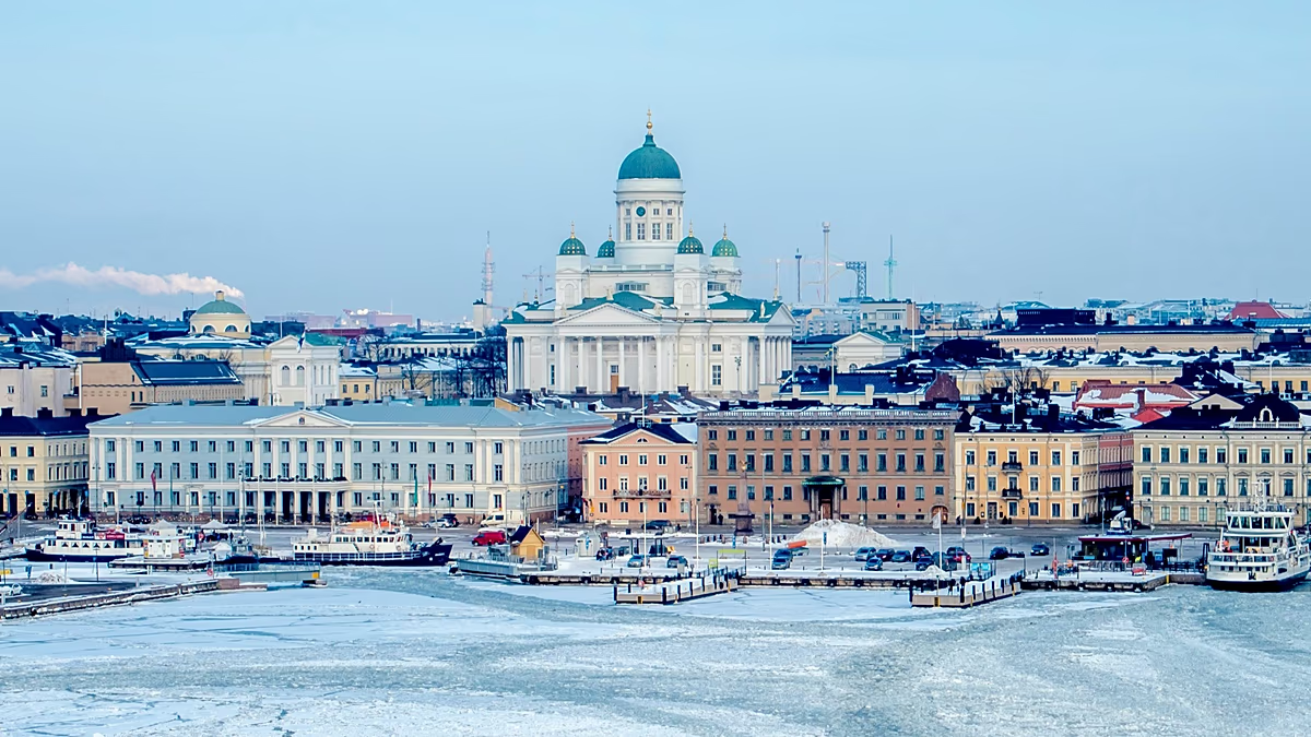







In an age increasingly dominated by tap-to-pay smartphone apps, digital banking transactions, and the silent, invisible flow of credit across global networks, physical banknotes often feel like a charmingly tactile relic from a rapidly fading era. Yet, as a recent wave of digital excitement and cultural debate has proven, our human relationship with paper money remains deeply personal, profoundly nostalgic, and surprisingly passionate. In late July 2026, social media channels across the European continent and beyond erupted into a vibrant, multi-lingual discourse following the European Central Bank’s highly anticipated announcement regarding the final shortlist of ten creative conceptual designs for the next generation of eurozone banknotes. From the sunny plazas of Lisbon to the snowy, wind-swept avenues of Helsinki, European citizens have been fiercely debating their favorite artistic themes, treating what might easily have been a dry, forgettable bureaucratic decision as a vital moment of cultural self-reflection and collective identity. This sudden, intense focus on the future aesthetic of our money has naturally cast a warm, appreciative light back onto the original banknotes we have spent decades storing in our wallets, handling with careless familiarity, and passing to one another without a second thought. For most of us, these colorful, durable slips of cotton-fiber paper are merely practical instruments of daily life and commerce, exchanged in a hurried rush for morning coffee, weekly groceries, or spontaneous gifts. We rarely slow down to truly study the intricate, beautiful artwork slipping through our fingers every day, yet physical cash possesses a unique, almost sacred magic; it carries the faint scent of countless human hands, the satisfying crinkle of worn currency, and a universal visual vocabulary specifically designed to unite hundreds of millions of diverse people across vast geographical, linguistic, and historical divides.
When the revolutionary single European currency was first introduced to the global public on the eve of the twenty-first century, its visionary creators were confronted with an unprecedented, highly delicate aesthetic challenge: how do you design a shared physical currency for an expansive family of diverse nations without exhibiting the slightest hint of national favoritism, cultural bias, or regional insecurity? If a banknote prominently displayed a globally recognized landmark like the French Eiffel Tower, the Italian Colosseum, or the Athenian Acropolis, it would inevitably risk alienating other proud member states, undermining the foundational message of equal partnership, and sparking endless political controversies about representation. The brilliant solution to this geopolitical puzzle came from Austrian artist and designer Robert Kalina, whose concept was a stroke of quiet, poetic genius: instead of showcasing actual, real-world monuments, the banknotes would display beautiful, completely fictionalized architectural styles that had naturally reinvented themselves across the European continent throughout its long and storied history. On the front of every individual note, an elegant window or an open gateway was painstakingly illustrated to symbolize the core European values of openness, transparency, mutual trust, and a shared, collaborative gaze toward a bright future. Meanwhile, on the reverse side of each bill, various stylized bridges were meticulously sketched to symbolize the eternal spirit of communication, political cooperation, and the crucial connection between the diverse nations of Europe, as well as between Europe and the rest of the global community. Each denomination was carefully structured to take ordinary users on a grand chronological tour of architectural history: the classical Greek and Roman columns on the €5 note effortlessly transitioned to the sturdy arches of the Romanesque period on the €10, the delicate tracery of the Gothic style on the €20, the harmonious proportions of the Renaissance on the €50, the wild dramatism of the Baroque and Rococo on the €100, the sleek iron-and-glass structural feats of the nineteenth century on the €200, and finally, the clean, minimalist lines of modern twentieth-century architecture on the massive €500 note. It was an incredibly cohesive, deeply philosophical vision of a unified continent, constructed entirely on dreamlike structures that did not exist anywhere on the surface of the Earth.
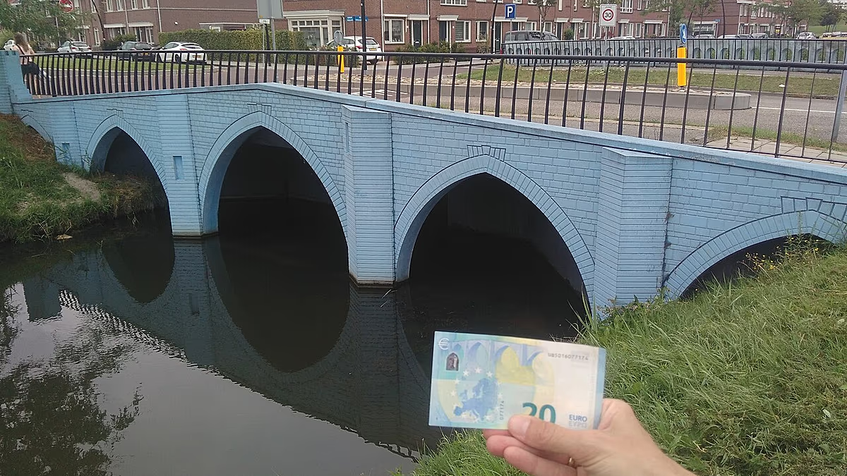
That was the established reality until a playful, exceptionally creative, and quietly subversive young Dutch graphic designer named Robin Stam looked closely at his own wallet in 2011 and decided that these fictional bridges represented a tragedy of unfulfilled potential and missed artistic opportunities. Born and raised in a culture long celebrated for its dry, self-deprecating wit, experimental design sensibilities, and unparalleled historic expertise in managing water, Stam conceived a wonderfully charming, slightly cheeky proposition that would turn the entire concept of European integration on its head: if the European Union refused to build the actual structures that united its citizens on paper, then the engineering-minded people of the Netherlands would build them in real life. With boundless enthusiasm and a portfolio of conceptual drawings, Stam approached the local municipal council of Spijkenisse, a quiet, largely residential suburban town nestled on the scenic outskirts of the major port city of Rotterdam, which happened to be in the middle of planning a brand-new, highly modern housing development creatively dubbed “Het Land.” The progressive local government of Spijkenisse, eagerly searching for an innovative way to set their new neighborhood apart from typical cookie-cutter Dutch suburbs while injecting a sense of civic pride, playfulness, and artistic flair into their community, enthusiastically embraced Stam’s audaciously colorful pitch. Turning these highly simplified, graphic vector illustrations into physically viable, load-bearing bridges capable of safely supporting pedestrian traffic and cyclists was an immensely complex engineering task, as the original banknote drawings had never been drafted with structural physics, material science, or practical construction standards in mind. Nevertheless, through a beautiful process of collective determination, experimental prototyping, and creative cooperation between Stam, local structural engineers, and brave civil planners, the whimsical dream of materializing fictional currency into walkable infrastructure began to take physical shape.
Between the years of 2011 and 2013, the peaceful, winding canals of the Het Land housing project in Spijkenisse were completely transformed as all seven of the fictional bridges from the euro banknotes were methodically constructed one by one, effectively turning this quiet residential corner into a living, interactive open-air museum of European monetary history and civil design. Rather than attempting to translate the designs into hyper-realistic, historically accurate stone, brick, or iron crossings that might mask their unique origins, Robin Stam made a brilliant, unapologetically bold designer’s choice: he insisted that the structures be constructed by pouring concrete dyed in the exact, vibrant, almost cartoonish pastel colors featured on the actual banknotes with which we are all so familiar. The final result of this creative decision was a delightfully surreal, Wes Anderson-esque landscape where everyday citizens can stroll across a bright, teal-colored classical span, sit beside a warm, terracotta-red Romanesque archway, or cycle over a deep, cobalt-blue Gothic bridge, all within a matter of minutes. Even the massive, bright purple modernist bridge based on the legendary €500 note—a high-value denomination that the European Central Bank has since officially ceased printing due to deep-seated concerns over its association with illicit financial transactions—stands fully realized in Spijkenisse, permanently preserved in solid concrete as a monument to twenty-first-century architectural idealism. When senior officials at the European Central Bank in Frankfurt first learned about this unauthorized physical manifestation of their copyrighted banknote artwork, there were understandable initial anxieties that their notoriously strict legal department might initiate a copyright and trademark lawsuit; fortunately, the central bankers fully embraced the underlying humor and profound spirit of the project, recognizing it as the ultimate, most sincere material tribute to the euro’s fundamental message of deep connection and shared progress. By physicalizing these symbolic representations of European connection, Stam and the town of Spijkenisse managed to capture the very essence of human ingenuity: the singular ability to take a sterile, elite bureaucratic abstraction of union and beautifully rebuild it into a tangible, joyful neighborhood space designed to facilitate local human connection.
Today, embarking on a journey to visit the legendary euro bridges of Spijkenisse offers an incredibly unique, highly sensory, and deeply humanizing travel experience that strips away the dry, intimidating politics of international finance and replaces it with a warm, intimate, and profoundly relatable sense of community life. To reach this vibrant architectural wonderland from the heart of the Netherlands, curious travelers, banknote enthusiasts, and design pilgrims need only board the efficient Rotterdam metro system on either the C or D lines, embarking on a relaxing, visually engaging journey out of the towering skyscrapers of the metropolis and into the lush, green-fringed river deltas of the suburbs. Upon stepping off the metro and walking into the modern Het Land development, visitors are immediately greeted by a scene that feels like stepping directly into an interactive, real-life graphic novel where the contents of a common leather wallet have magically expanded to monumental proportions. On any given afternoon, a visitor can sit quietly on a canal bank and observe the heartwarming reality of local Dutch residents going about their ordinary, unhurried routines—energetic children racing their scooters across the bright green Baroque €100 span, couples holding hands as they cross the golden-brown €200 bridge, and commuters cycling home from work over the vibrant orange Renaissance €50 structure. The colorful bridges have become deeply and permanently woven into the social fabric of the neighborhood, serving as the familiar backdrop for childhood games, graduation photos, morning dog walks, and romantic evening strolls. There is an exquisite, beautiful irony in the fact that these iconic bridges, originally designed by a committee to represent “nowhere in particular” so that they could belong equally to “everyone,” have finally found a specific, cherishable, and intensely local home in a cozy Dutch suburb, beautifully demonstrating how large-scale, global concepts are only ever given true human meaning when they are warmly adopted and cared for by a small, close-knit local community.
As the citizens of Europe continue to cast their public votes and engage in passionate debates regarding the cultural values, ecological themes, and artistic merits of the new banknote designs throughout 2026, the real-world bridges of Spijkenisse stand as a powerful, enduring monument to the fundamental human desire to build real, physical connections in an increasingly digitized, fragmented, and virtual world. Whether the next generation of Euro banknotes ultimately features depictions of European rivers, native wildlife, clasped human hands, or shared cultural milestones, the legacy of the original fictional bridges serves as a gentle, poetic reminder that money is always much more than just a cold, transactional tool of economic convenience. It is a vital, historically rich artistic canvas that reflects who we are as a society, what we collectively value, and how we choose to define our shared spaces, building metaphorical and physical bridges across the historical divides of different languages, cultures, and traditions. In a cultural moment where physical currency is steadily fading from our daily lives and banknotes are being gradually replaced by the cold glow of touchscreens and instant digital transfers, these magnificent, colorful concrete structures in the Netherlands make sure that the original, highly poetic dream of an open, cooperative, and interconnected Europe remains firmly and beautifully anchored in the soil. Robin Stam’s playful, visionary intervention offers a timeless lesson in human creativity, proving that when we take the time to look closely at our everyday surroundings, we can find spark notes of joy and inspiration in the most mundane, overlooked places, turning abstract concepts of global financial unity into colorful, concrete pathways that bring human beings closer together one step at a time.