


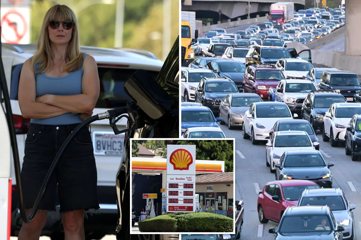
1. There’s a particular kind of dread that settles over a Los Angeles driver when the fuel gauge drifts toward empty. It’s not just the math of filling up; it’s the arithmetic of making it to payday, across the city’s impossible sprawl, with enough in the tank to also get back home. The question “Drive across town? In this economy?” has become something of a dark joke in Southern California, where a casual trip to see a friend or run a simple errand now feels like a financially significant decision. Every stoplight, every freeway backup, every mile of glittering pavement feels like it comes with a hidden toll. And now, a newly viral map has given that anxiety a painfully clear shape. The map, created by a fed-up commuter and posted to Reddit, shows just how far a $20 bill will get you in Los Angeles today—and the answer is both humiliating and heartbreaking. Based on current metro-area average gas prices, overlaid onto the local road network, and using a fuel economy estimate of 28 miles per gallon, the map is a stark illustration of a reality that anybody living and driving in Southern California already knows: it has become painfully, shockingly expensive to be mobile.
2. What makes the map so powerful is its brutal simplicity. Twenty dollars used to feel like a reasonable buffer—enough to get you where you needed to go and maybe buy some time to find cheaper gas. Now, that same twenty-dollar bill gets the average driver 29 fewer miles than it did just before the escalation of tensions in the Middle East, specifically on February 27. To put that in human terms, that’s the difference between being able to drive all the way from downtown Los Angeles to Long Beach, or stopping half-way there and staring at a fuel light that never lies. For anyone who has made that particular drive, the comparison is devastating because those 29 miles represent real distance: school drop-offs, back-to-back appointments, the kind of daily logistics that define working life in a sprawling, car-dependent metropolis. The map’s creator didn’t add much drama or spin—none was needed. By visualizing the geographic impact of the price hikes, the map transforms abstract news about inflation and global conflicts into a very personal revelation. It tells you, straight to your face, that the hours you spend in traffic and the money you spend on gas are no longer just an annoyance. They’re the boundary lines of your actual life, and those lines are quietly shrinking.
3. The reaction to the map has been a chorus of exhaustion, sarcasm, and grim empathy from commenters across the internet. Some immediately blamed their fellow drivers, watching the behavior of gas-guzzling pickup trucks roaring between red lights and wondering why the price ceiling hasn’t hit high enough to change the culture of the road. Others insisted that no price spikes really matter until stations begin rationing fuel, the kind of doomsday scenario that once seemed impossible but no longer feels entirely out of reach. One person observed that people would continue to waste fuel with their foot on the accelerator, idling in drive-thrus instead of parking, and speeding down freeways, because most drivers don’t actually connect the dots between their daily habits and their tank ending up empty by Friday. Then there were the quieter, rawer comments—the ones about rent and utility bills and the choice between filling the tank and filling the fridge. “My monthly gas is about to be the same price as my apartment I rented in college,” one commenter said, and it was the kind of line that separated those who merely scan the headlines from those who live them. The comments section wasn’t just a forum; it was a support group where hundreds of strangers all realized, at the same moment, that they were enduring the exact same financial squeeze, hurtling down the same congested highways, all silently doing the mental math of what it costs just to exist.
4. Behind the map is a larger statewide reality that has been growing more brutal week after week. The average price for a gallon of regular gasoline in California recently hit a gut-wrenching $6.08, climbing another nineteen cents in just seven days. That’s not a slow leak; that’s a sudden, painful burst that leaves paychecks punctured well before the end of the month. Comparison is often a useful tool, but here it only makes things worse: over the last year, the statewide average has surged by $1.43 per gallon, and diesel has skyrocketed dramatically to a record $8.35 per gallon, a full $3.18 more than it was just a year ago. For everyday drivers, the numbers are numbing. They sweep over you in headlines and financial tickers, but they ignore the human impact behind them: the delivery driver flipping through radio stations between deliveries, the single parent running two or three different shifts, the student commuting to community college because online learning didn’t fix the need for Wi-Fi and libraries. Terrible as gasoline is, diesel is arguably worse, because diesel moves the trucks that carry nearly everything people buy. When diesel costs more, food becomes more expensive, rent becomes more expensive, and everything from produce to medicine carries a hidden fuel tax that nobody votes for but everyone pays.
5. Patrick De Haan, head of petroleum analysis at GasBuddy, has tried to offer a small shaft of hope without sugar-coating the situation. He says prices could dip when California makes its annual transition from the more expensive summer-blend gasoline to the winter blend at the end of October, a routine shift that sometimes leads to modest relief at the pump. But he also makes clear that this relief is fragile and far from guaranteed. If new attacks or additional escalations in the Middle East continue to disrupt global oil markets, prices could accelerate again at a pace that makes this fall’s spike look almost gentle. “It’s really more contingent on whether or not we’ll continue to see the pace of escalations that have contributed to the faster pace,” De Haan said. “If there’s new … attacks, if there’s more escalations—then yes, prices could continue to accelerate at this pace.” In other words, the map that has so brutally captured this moment isn’t a fixed photograph of suffering. It’s a moving target, and none of us get to choose where the arrow lands. De Haan’s carefully measured language betrays a deeper anxiety: the forces pushing gas prices upward are not simply economic cycles, but international conflicts, geopolitical posturing, and a fragile energy market held together with tape and prayer.
6. And yet, the true heartbreak of this moment isn’t the global economics—it’s the quiet, everyday choices ordinary people are forced to make. To drive across town now isn’t just a spur-of-the-moment decision; it’s a small luxury that some can no longer afford. Commuters in the outer neighborhoods, far from the polished downtown towers and beachside villas, are feeling the squeeze most acutely. They are the essential workers who show up before dawn to stock shelves, care for the elderly, and pour coffee into the paper cups of people already late for meetings. For them, there is no “work from home” option, no hybrid schedule, no choice to stay off the road when the tank is low and the wallet is lighter than a paper bag. The map itself may be a single individual’s artistic interpretation of public data, but its meaning is universal: it inscribes, in lines and distances, the geography of inequality that has become the backdrop of modern American life. Some people see those 29 vanished miles and simply shrug; others recognize them as the exact shape of a missed family birthday, an abandoned job interview, or a promise made to a child that can’t quite be kept this month. But even in the midst of this collective exhaustion, there is something deeply human about the way we keep moving anyway. We complain, we argue, we share maps and cast blame, and then we get back in our cars the next morning, turn the key, and hope, more than anything, that the gauge stays mercifully high and the road ahead is kind. Because what else can we do? The map doesn’t lie, but neither do we—not when we say we’re just trying to make it through another day in this beautiful, infuriating, impossible city. The sun still sets over the Pacific in brilliant streaks of orange and pink, and somewhere on a freeway on-ramp, a driver glances at the dash, calculates what’s left in the tank, and decides to drive just a little bit slower—not because they’re safe, but because every mile counts.