


Austin’s $1.1 Million Rebrand Sparks Controversy and Mixed Reactions
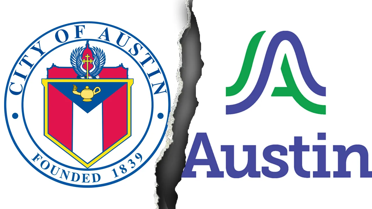
Austin’s recent unveiling of its first unified brand logo has ignited a firestorm of public reaction, highlighting the tension between modernization efforts and fiscal responsibility in city governance. On September 4, city officials proudly revealed a new wavy blue and green “A” logo as part of a $1.1 million rebranding initiative aimed at consolidating the city’s visual identity. This ambitious project seeks to replace the more than 300 different logos currently used across Austin’s municipal departments with a single, cohesive brand. The effort stems from a 2018 City Council decision to establish “a consistent and clear brand” for the city, but the reception has been far from universally positive, with critics questioning both the design and the expense during a time when some essential city services face challenges.
The timing and cost of the rebrand have become lightning rods for criticism, particularly from political figures like Rep. Chip Roy, who didn’t mince words in his assessment. The Texas Republican accused Austin officials of prioritizing “woke” symbolism over addressing urgent needs like public safety. “We have people in Austin who don’t get their 911 calls answered,” Roy pointed out during an appearance on The Will Cain Show, suggesting that the million-dollar expense was inappropriate when the city has witnessed “an increase in crime” following what he characterized as cuts to police funding. His comments reflect a broader concern about resource allocation in municipal governance—whether aesthetic updates should take precedence over fundamental public services.
Despite the backlash, city leadership has stood firmly behind the rebranding effort. City Manager T.C. Broadnax emphasized the historic significance of the initiative, noting that “For the first time in Austin’s history, we will have a logo to represent the city services and unify us as one organization, one Austin.” Jessica King, Austin’s Chief Communications Director, offered a poetic interpretation of the design elements, explaining that “The logo itself reflects the hills, rivers, and bridges that serve to connect us to one another,” while the color palette draws inspiration from Austin’s natural surroundings—”violet crown skies and the green canopies of our parks and trails.” These statements reflect the administration’s view that visual identity plays a meaningful role in civic cohesion and representation.
The implementation plan reveals a measured approach to the transition. The rollout will begin on October 1, 2025, prioritizing digital assets such as the city website, social media channels, and newsletters before gradually incorporating the new branding into physical items like uniforms, vehicles, and signage. This phased approach is deliberately designed to “minimize impact on the City budget,” according to official releases. Budget documents detail the allocation of the $1.1 million expense, with $200,000 devoted to design work, $640,000 for vendor services, and $115,000 earmarked for public awareness campaigns. The substantial investment underscores the significance city officials place on the rebranding initiative, even as they acknowledge financial constraints.
Public reaction to the new logo has been swift and polarized, with many residents taking to social media and local news outlets to express their opinions. Some critics have been particularly harsh, with comments comparing the design to “a homeless tent” or “a bad biotech company’s rebranding.” Others simply expressed disappointment with abbreviated reactions like “Bruhhhh.” The designer, DJ Stout of Pentagram, acknowledged the challenges of the project, describing it as “the ultimate design by committee” and noting Austin’s liberal political leanings. However, not all feedback has been negative—some residents have defended the new look as appropriately “minimalist” and praised it as “definitely a modernization of the old one,” suggesting that aesthetic preferences vary widely among Austin’s diverse population.
Marketing experts offer a valuable perspective on the controversy, reminding critics that logos often gain meaning through association over time rather than immediate public acclaim. As marketing professor Chris Aarons pointed out to local media, “The Coca Cola was just a script, but it’s a beautiful script. But over 120 years, they made it mean happiness. It is really what the entity makes that logo mean at the end of the day.” This insight suggests that the true test of Austin’s rebranding will come not from initial reactions but from how effectively the city incorporates the new visual identity into its services and community engagement over the coming years. While the debate continues about whether the million-dollar investment was justified, the underlying question remains: will this new symbol eventually come to authentically represent Austin’s unique character and municipal identity, or will it be remembered primarily for its controversial price tag and divided reception?


