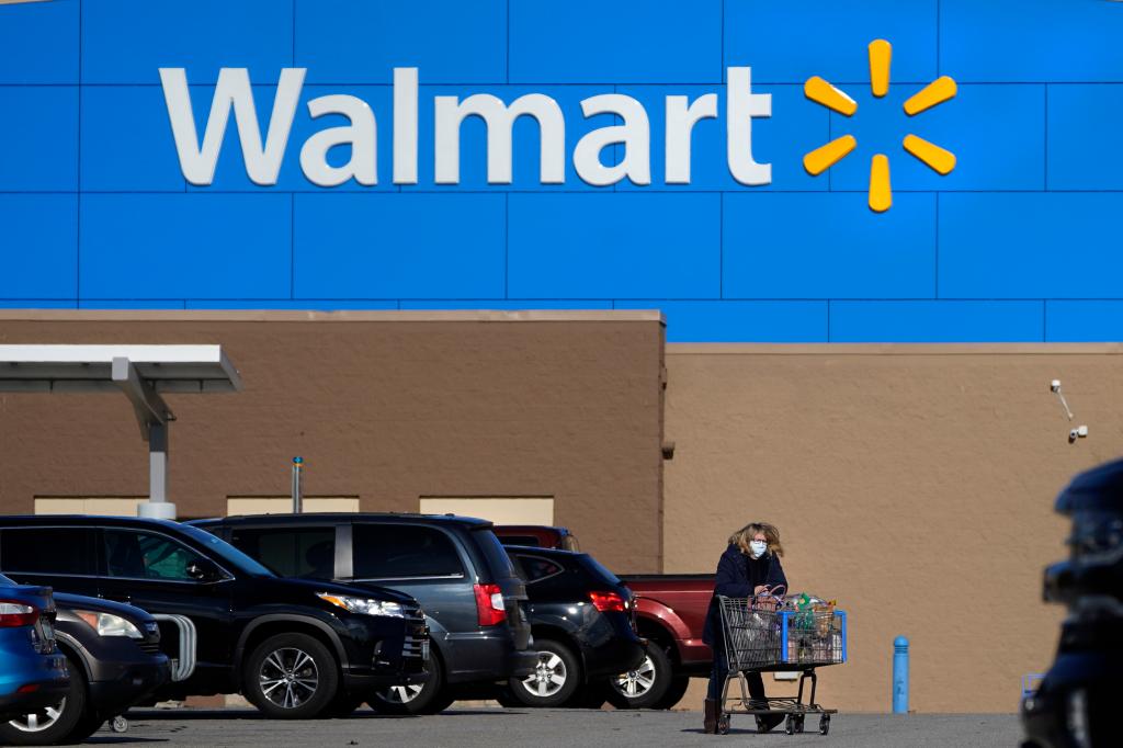
Walmart, the retail behemoth, recently unveiled a refreshed brand identity, its first in two decades, sparking a wave of reactions, ranging from bewilderment to outright mockery, across social media platforms. The company characterizes the update as a comprehensive brand refresh, mirroring its evolution and reflecting its modern ethos. The core elements of the redesign include a revised wordmark, supposedly inspired by founder Sam Walton’s iconic trucker hat, and a tweaked color palette featuring “True Blue” and “Spark Yellow,” designed to inject a sense of freshness into the brand’s visual identity. However, the subtle nature of the changes has left many observers scratching their heads, questioning the perceived lack of significant difference between the old and new logos.
The online discourse surrounding the rebrand has been dominated by incredulity. Many social media users expressed their astonishment, with some questioning the rationale behind such a seemingly minor alteration. The prevailing sentiment centered on the perceived insignificance of the changes, with many struggling to discern any notable difference between the previous and updated logos. This led to a flurry of sarcastic comments and memes, with users jokingly questioning whether anyone would even notice the change. The cost of the rebranding exercise also became a point of contention, with some speculating on the expenditure involved in such a subtle visual shift.
The minimal nature of the logo redesign prompted comparisons to previous brand refreshes within the retail industry, with some users highlighting more dramatic overhauls undertaken by other companies. The subtle approach taken by Walmart stands in stark contrast to these examples, further fueling the online debate about the effectiveness and necessity of the rebrand. Some users even suggested that the lack of discernible change might lead to confusion among customers, potentially impacting brand recognition.
However, amidst the criticism, a counter-narrative emerged, suggesting that the very controversy generated by the rebrand might be a testament to its success. Proponents of this view argue that the widespread discussion surrounding the logo update, regardless of its tone, has inadvertently amplified Walmart’s brand presence and generated significant free publicity. This perspective posits that the subtle nature of the changes, coupled with the pre-existing brand recognition, allows for a seamless transition without alienating customers while still sparking conversation and renewed interest.
This “controversy as marketing” theory suggests that Walmart strategically leveraged the predictable online reaction to generate buzz and maintain relevance in the public consciousness. By implementing a subtle change, they sparked discussion and debate, effectively turning the rebrand itself into a news story. This approach minimizes the risk of alienating loyal customers while simultaneously capitalizing on the free publicity generated by the online chatter. Furthermore, the minimal changes translate to minimal costs in implementing the new logo across its vast network of physical stores and online platforms.
Walmart’s rebrand, therefore, can be interpreted as a calculated move, leveraging the power of social media to generate awareness and maintain brand relevance without incurring significant costs associated with a more drastic visual overhaul. While the immediate reaction has been largely critical, the long-term impact remains to be seen. Whether the subtle changes will contribute to a refreshed brand perception or simply fade into the background remains a question that will be answered by consumer behavior and market dynamics in the coming months and years. The success of the rebrand will ultimately be determined by its ability to contribute to Walmart’s overall business objectives, rather than solely on the initial public reaction.


